How to Make Circle Buttons CSS
In this tutorial, you’ll learn how to make circle buttons using CSS step by step.
How to Make Circle Buttons Using CSS
Step 1: Specify Button Code in HTML
By default, HTML gives us <button> tags to define a button on a web page. But we can also use various other HTML elements and convert them to buttons. For example, you can use <div> or <a> elements and convert them to a button using CSS.
In this tutorial, I will use <a> (anchor tags) that are used for adding hyperlinks in HTML to make circle buttons.
Here below is the HTML code for the button.
→ index.html
<a href="#"> Button </a>
You can copy and put this line of code wherever you want the button to display on your website.
Code Explanation:
I used a pair of <a> tags and added a random text “Button” as a demo. You can add custom text. You can also replace the # symbol with the link where you want the visitor to go after clicking the button.
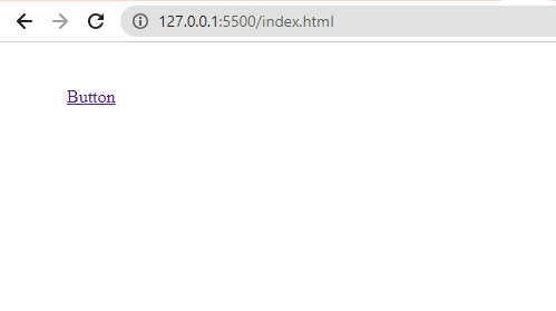
The output of this code is shown below, we will turn this simple link into a circle button using CSS.
Step 2: Specify CSS Rules for the Button
To turn the button in to circle using CSS, first I will select the HTML <a> element with the help of the CSS element selector. And then I will apply different CSS properties.
The below code example shows the complete CSS rule to make a circle button.
→ style.css
a{
background-color: #19c37d;
color: #ffffff;
text-decoration: none;

display: inline-block;
width: 100px;
height: 100px;
line-height: 60px;
text-align: center;
border-radius: 50%;
}
Code Explanation:
- First of all, I used a CSS element selector which is a. Then, I added some CSS properties inside curly braces.
- The background-color property specifies the color of the button. I am using green background by specifying its HEX value.
- The color property will change the text color of the button from blue to white.
- The text-decoration property removes the underline from the text link. Because by default, <a> tags shows underline for links.
- The <a> is a block-level element, I used the display property to convert this to inline-block. So that I can apply width and height to the button.
- Then, I set the width and height properties to 100px.
- The line-height and text-align properties will put the text in the center of a button.
- Last of all, I used border-radius property to transform the button from a square to a circle shape.
Output:
Before using border-radius, the button was square in shape. Then, I turned it into a circle button using CSS border-radius property by setting it to 50%.
You can just copy-paste the CSS code into your stylesheet to implement this on your website.
But as we’re using CSS element selector which will select all the <a> elements present in the HTML document. Due to this all the links present on your website that are specified using <a> tag will turn into circle buttons. To avoid this, simply define an HTML class and use a class selector in CSS code.
The CSS class selector will apply the styles to only the link in which the class is specified. For example, to do this first I defined a class for the button using the class attribute in my HTML code as shown below.
→ index.html
<a href="#" class="button"> Button </a>
Now, I can use the HTML class to select only the link in which the class attribute is specified. I also made changes to the CSS code.
→ style.css
.button{
  background-color: #00acee;
  color: #ffffff;
  text-decoration: none;

  display: inline-block;
  width: 80px;
  height: 80px;
  line-height: 50px;
  text-align: center;
  border-radius: 50%;
}

i{
  font-size: 28px;
  padding: 0;
}
Now, it will turn only that button to circle where the class is defined.
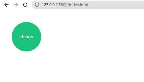
CSS Circle Button with Icon
You can also use icons instead of text inside the circle buttons. I will use font-awesome icons for this.
First, I added the following font-awesome CDN link between the <head> tags of HTML to use the icons.
→ index.html
<link rel="stylesheet" href="https://cdnjs.cloudflare.com/ajax/libs/font-awesome/6.0.0/css/all.min.css" integrity="sha512-9usAa10IRO0HhonpyAIVpjrylPvoDwiPUiKdWk5t3PyolY1cOd4DSE0Ga+ri4AuTroPR5aQvXU9xC6qOPnzFeg==" crossorigin="anonymous" referrerpolicy="no-referrer" />
In the below code, I’m using the Twitter icon. To do this, I just made little changes to the HTML code. I put the icon inside <a> tags using HTML <i> element as shown below.
→ index.html
<a href="#" class="button"> <i class="fas fa-envelope"></i> </a>
Then, I also did some changes to adjust the design of the circle button with the icon using CSS.
→ style.css
.button{
    background-color: #00acee;
    color: #ffffff;
    text-decoration: none;

    display: inline-block;
    width: 80px;
    height: 80px;
    line-height: 50px;
    text-align: center;
    border-radius: 50%;
}

i{
    font-size: 28px;
    padding: 0;
}
In the above code, I defined another CSS rule for <i> element. Inside that,
- I used the font-size property to change the font size of the icon and also set the padding to 0.
- Plus, I applied the background-color property to make the color of the button look similar to Twitter.
The output of the CSS circle button looks much better with an icon inside it as shown below.
However, it’s possible to use images instead of text or icons. All you have to do is, just put the <img> tag inside <a> tags as shown below.
But remember to use a small image and adjust its size according to the button using HTML width and height attributes.
Adding More CSS Effects to Circle Buttons
You can apply more effects to your circle button using CSS. For example, you can apply the hover effect and change the background color on the hover, you can add shadows using the box-shadow property, and 3D effects using transform, etc.
That’s it. ✅
Now, you know much about creating circle buttons with CSS. If you have any questions related to this tutorial, then feel free to ask in the comments section below.
More Tutorials Related to Buttons:
Don’t forget to help others by sharing this tutorial! 👍
