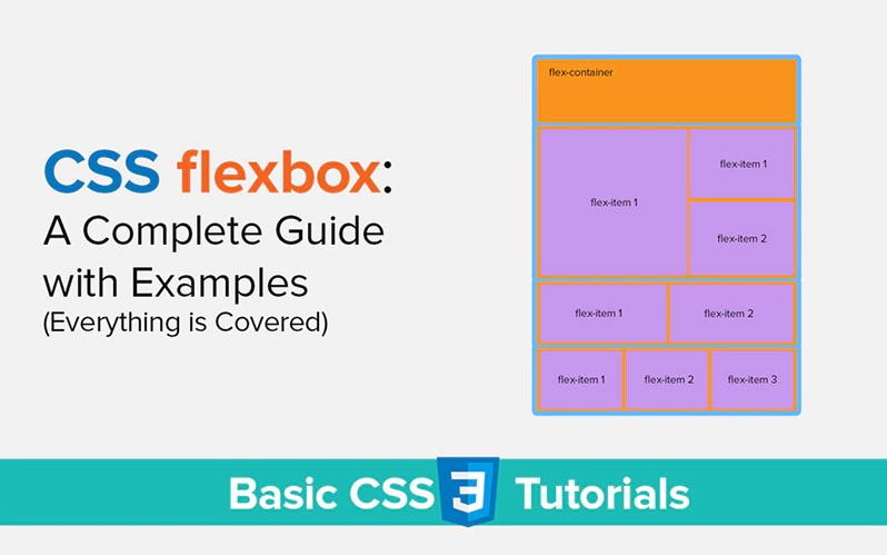
CSS Flexbox: A Complete Guide with Examples
In this tutorial, you will learn CSS flexbox completely with examples. In this guide, I have covered everything about CSS flexbox also known as CSS flexible box layout. And I assure you that this guide will be very helpful for everyone whether you are a beginner or an expert.
I divided this guide into different parts so that you understand the flexible box layout in detail with a lot of ease. After reading this complete guide, you will be able to create flexible layouts on your website like a pro.
Things that I covered in this tutorial:
- What is CSS flexbox?
- Example of CSS flexbox
- flex-container vs. flex-items
- CSS flex-container
- All the flex-container properties
- CSS flex-items
- All Properties that use for flex-items
If you’re a beginner and do not know about CSS. Then don’t worry, here is our complete guide about what is CSS.
So let’s get started.
What is CSS flexbox?
CSS Flexbox is a one-dimensional web layout module. It allows us to create responsive elements layouts for our website. We can arrange the elements in rows and columns. Before CSS Flexbox, we use floats, tables, blocks, and Positioned properties to create web layouts.
Furthermore, in simple words, the CSS flexbox is a CSS layout module that we use to display and arrange elements inside another element or container.
Example of CSS Flexbox
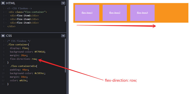
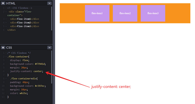
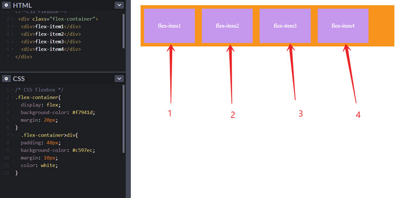
So, in this example, I created an <div> element with a class named flex-container in HTML. And then I created three <div> elements inside that <div> element. Like this below.
<div class="flex-container">
  <div>flex-item1</div>
  <div>flex-item2</div>
  <div>flex-item3</div>
</div>
Now, in the next step, I added some CSS to convert this to flexbox. Then some more CSS to style this.
.flex-container{
  display: flex;
  background-color: #f7941d;
  margin: 20px;
  justify-content: center;
}
.flex-container>div{
  color: white;
  padding: 40px;
  background-color: #c597ec;
  margin: 10px;
  border: 1px solid grey;
}
Now, it will display like this in your browser. And don’t worry about CSS properties, we are going to see that in detail.

Difference between Flex Container vs. Flex Items?
As you saw in the above example. The outer area with an orange background color that we created with the <div> element is called a flex container. And inner <div> elements that look like boxes, with purple background color are called flex-items.
CSS Flexbox Container (Parent Element)
The area with orange color is a flex container. And we will call it a parent element because we apply the display: flex property to only parent elements. And the flex items in this container are its child elements.
How to Create CSS Flexbox Container?
It is very easy, just take <div> HTML element and give that a class, and this will be your parent element. Then put some HTML elements inside that element and these are called child elements.
Look at the HTML code below. I use the same HTML code as in the above example to demonstrate to you.
<div class="flex-container">
  <div>flex-item1</div>
  <div>flex-item2</div>
  <div>flex-item3</div>
</div>
Now we will use the display property and give it a value flex. To convert this HTML code to flexbox through CSS. Like this below.
.flex-container{
  display: flex;
}
Remember: You must have to apply display: flex; property only on the parent element to see the results.
The Flex Container Properties
We can apply six types of CSS properties to work with flex containers.
CSS flexbox flex-direction Property
We use the flex-direction property to specify the direction of flexible boxes inside a container. Flex-direction has four values.
flex-direction: row | column | row-reverse | column-reverse;
How do we use it? Let’s see the code. By default, flex-direction has a value set to row already. If you specify flex-direction: row; then it will look like this below.
flex-direction: row;
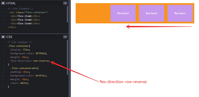
If we change flex-direction to row-reverse then all the flexible items in the container will be in the reverse direction.
flex-direction: row-reverse;
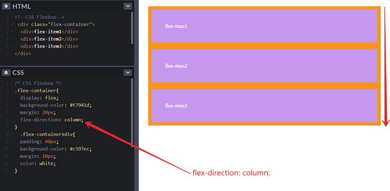
If we change it to a column then all the flex items show in the vertical direction.
flex-direction: column;
flex-direction: column-reverse;

CSS flexbox wrap
By using the flex-wrap property, you can wrap your flex items. It has 3 values.
flex-wrap: wrap | nowrap | wrap-reverse;
It is useful for responsive layouts. Whenever we resize our screen size or small screen sizes, the flex items automatically adjust their position.
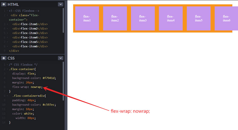
Note: By default, flex-wrap is set to nowrap.
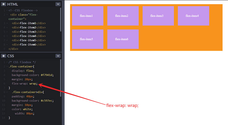
Example: I have created six flex items to clearly demonstrate to you. When we set flex-wrap to wrap then the flex items are automatically adjusted.
flex-wrap: wrap;
If specify flex-wrap: nowrap; then
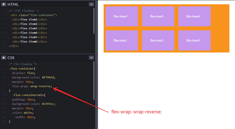
flex-wrap: wrap-reverse;
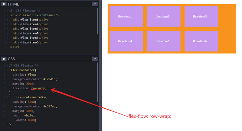
CSS flex-flow Property
In CSS flexbox, flex-flow is a shorthand property for both flex-direction & flex-wrap. When we use this property then first we specify the flex-direction and then the flex-wrap value. Like in the example below.
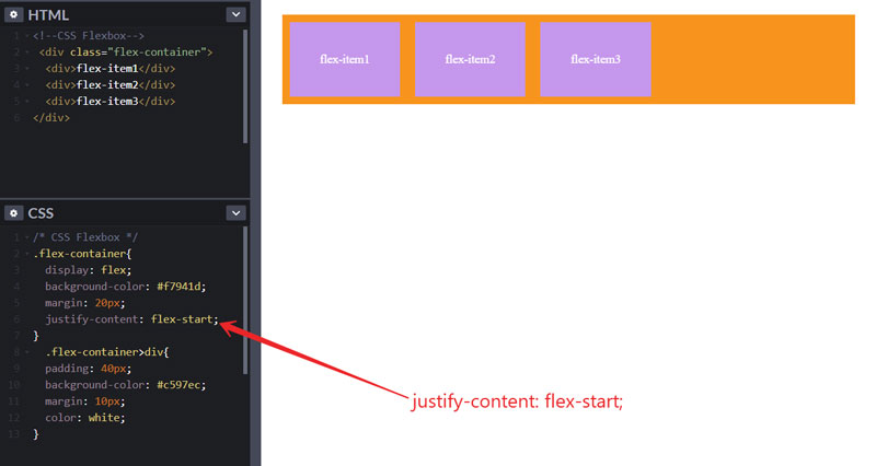
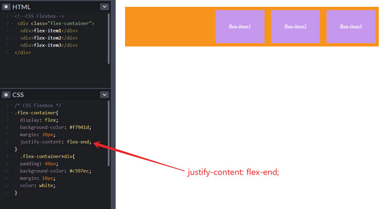
CSS justify-content Property
By using the justify-content property, we can horizontally align the flex items. It has 5 values.
justify-content: center | flex-start | flex-end | space-between | space-around;
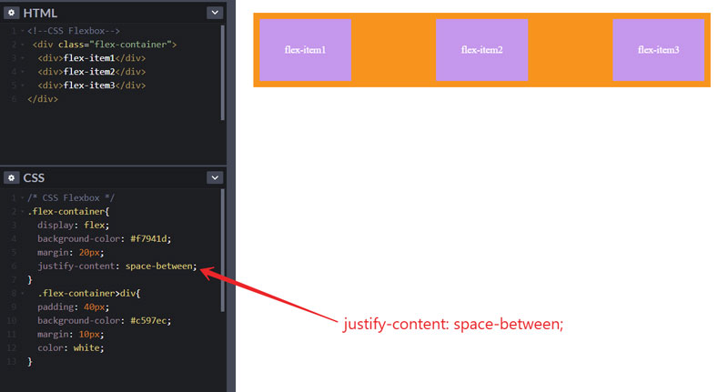
To specify space around the flex items.

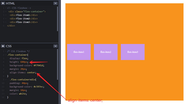
CSS align-items Property
This property is used for aligning flex items vertically. Four types of values that you can use.
align-items: center | flex-start | flex-end | stretch | baseline;
One more thing, you must use the height property to specify the height of your flex container to see the effect. So let’s the examples.
align-items: center;
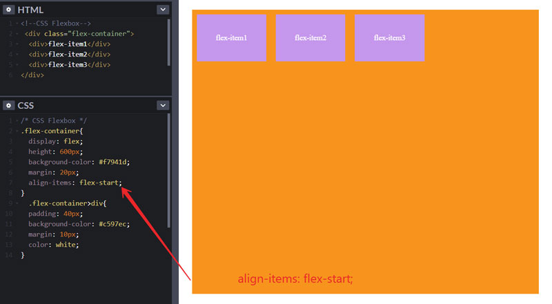
Use align-items: flex-start; to show the flex items at the start.
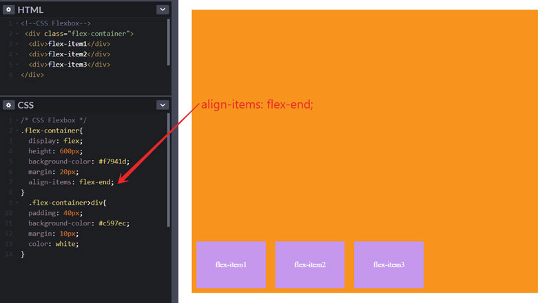
align-items: flex-end;
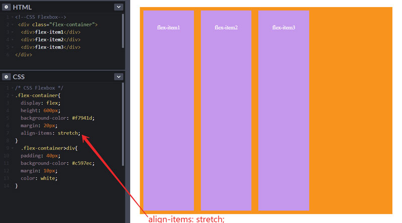
And align-items: stretch; is use to stretch the flex items.
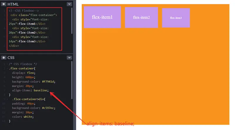
align-items: baseline;
This property will affect only if you change the font sizes of flex items. Like in the image below.
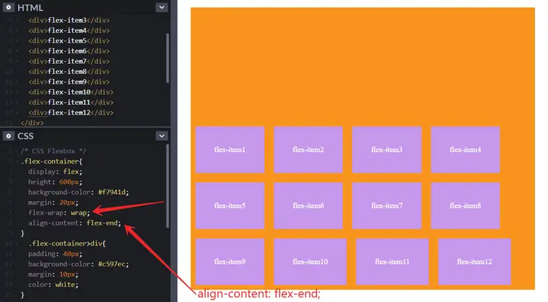
CSS align-content Property
This property is used for aligning the flex lines in a flex container. It has four values like the other two properties.
align-content: space-between | space-around | flex-start | flex-end | center;
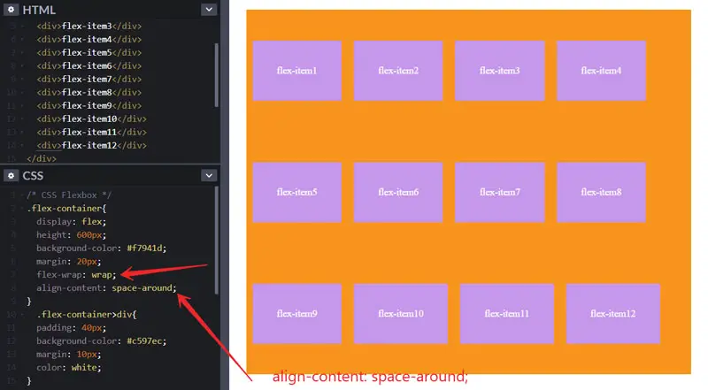
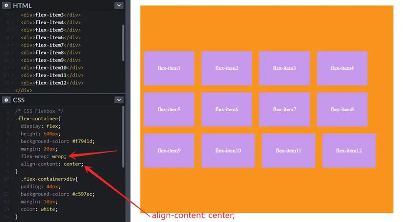
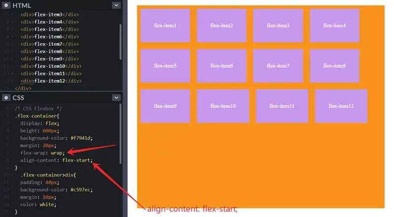
Let’s see examples of this. In these examples, I will create 12 flex items to clearly demonstrate the align-content property. And listen, you have to use the flex-wrap property first to see the effect.
To specify the space around the flex lines, we use align-content: space-around; property.
align-content: space-between;

To center the flex lines, we use align-content: center; property.
align-content: flex-start;
align-content: flex-end;
Flex Items (Child Elements) – inside flex container
In CSS flexbox, flex items are child elements of the flex container. And these are inside of flex container. As we saw in the previous examples, the purple boxes are flex items.
Properties use for flex items:
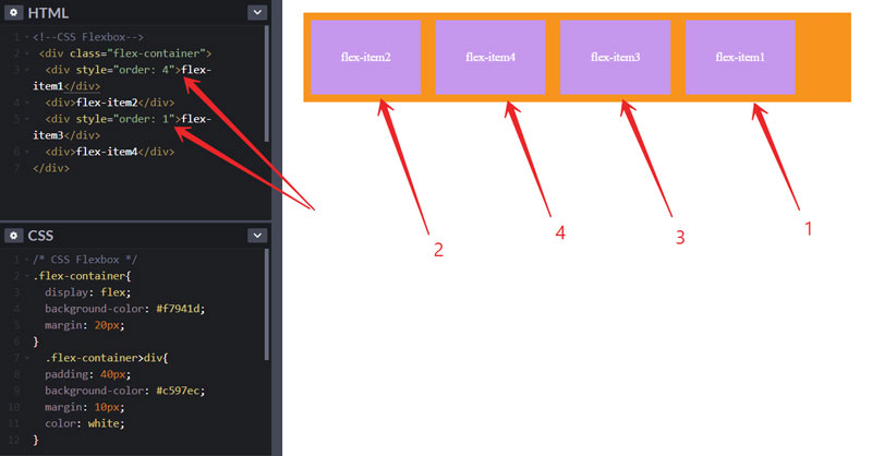
CSS Flexbox items “order” Property
We use order property to specify the order of flex items. As in the example below, see the order of flex items before the change.
If we change the order of the flex items then it will look like this below. Instead of 1, 2, 3, 4, the order is changed and it is 2, 4, 3, 1. And listen, the order must have value in numbers.
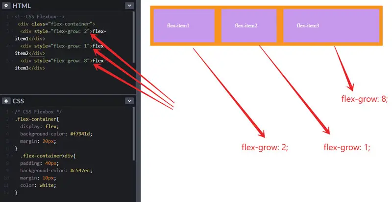
CSS flex-grow Property
To specify how much flex items should grow, we use the flex-grow property. The value of flex-grow will be in numbers.
CSS flex-shrink Property
To shrink the flex item, we use the flex-shrink property.
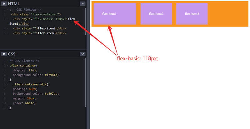
CSS flex-basis Property
We use a flex-basis to specify the initial length of the flex item.
CSS flex Property – in CSS flexbox
The CSS flex property is the shorthand property for flex-grow, flex-shrink, and flex-basis. The syntax of flex property is.
.flex-items{
 flex: 0 0 100px;
  /*----
  Here
  first value is flex-grow.
  Second value is for flex-shrink.
  And Third value is for flex-basis. Like this
  flex: flex-grow-value flex-shrink-value flex-bais-value;
  ----- */
}
CSS align-self Property
We use the align-self property to specify the alignment of the flex item inside the flex container. You must have to specify the height of the flex container to see the effect. So let’s see the example below.
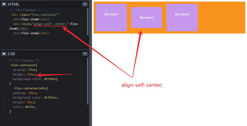
Also, it has 3 types of values that we can use.
align-self: center | flex-start | flex-end;
So, this is all about CSS flexbox. I hope this guide will be helpful to you. If you have any questions related to this then please leave a comment below.
